Don't get soft on me
I am pressed for time this weekend, so instead of coming up with something entirely new, I thought that I'd do an addendum to my last post. I thought I dug relatively deep in that essay about whether global economic growth is accelerating. Obviously, it isn't easy to a give a clear answer to that question—we're doing economics after all—but the evidence from headline leading indicators suggest that the global economy picked up speed at the end of last year. Regular punters at this space, and my friends in the market, though, weren't impressed. Specifically, I was told that I was neglecting the spread between hard and soft data.
This is meme that has gathered momentum recently. Below is a number of charts which have rolled through my Twitter feed in the past few days, and Bloomberg's journalists also have been pestering their TV guests about it. The first chart shows the spread everyone is talking about. The white line is the Bloomberg U.S. "soft data" surprise index, which has jumped recently and the blue line is the U.S. "hard data" surprise index. The second chart shows BCA's attempt to turn this into a bearish indicator for the market. Finally, the third chart shows how much ground the hard data have to make up to conform to the soft data in Q1. That one comes from Nordea.
I suppose that if you absolutely need a reason to sell equities, a combination of the charts above will do, but I am not sure that I am completely convinced that there is a story here. Lets be clear about the relationship between soft and hard data. Consumer and business surveys are best understood as short-leading indicators for the economy. This is to say, they are some of the first monthly indicators we get in the reference month, and they are rarely revised. By contrast, hard data such as industrial production, retail sales, imports/exports and construction output are released with a lag to the reference month, and are subject to sometimes large revisions. Between the two, the survey data then becomes a "real-time" monthly indicator of the economy, and a leading indicator for hard data as released. I am open here to the idea that components of some surveys have a longer lead, but that ultimately is a question of empirical investigation.
If you subscribe to this worldview, a relative surprise index doesn't really make much sense. After all, if what you're trying to do is to predict hard data you have to take some information as given; i.e. the survey data. If the surveys are strong, you should then be expecting hard data to follow. You might have a suspicion that the surveys, for some reason, could be wrong. That's fine, but then that should be your starting point then, not whether they're "surprising" relative to expectations or not. For the record, I have checked this in a Eurozone context, and I can't really find any evidence that they surveys are producing larger errors in their forecasts at the moment than usual. In the U.S., I suppose things could be different. Markets are happy to accept that Mr. Trump will be great for U.S. growth, but not so hot on contemplating the potential for an accident. That meme could have led business and consumer expectations to run ahead of the real world, which again could have led investors to run ahead of the "reflation trade." My bias is to agree with the argument that equity markets already has priced in the good news. But when I run the numbers I have to concede that this is really difficult to show. Some indicators support this argument, some don't. There are plenty of signs that suggest equities are stretched—and recent price action suggests downside is emerging—but I am not sure the hard v soft data spread is one of them.
Finally, if indeed survey data are sending an overoptimistic signal on the economy, isn't the risk just as high that the surveys will take a step back than it is for hard data to disappoint.
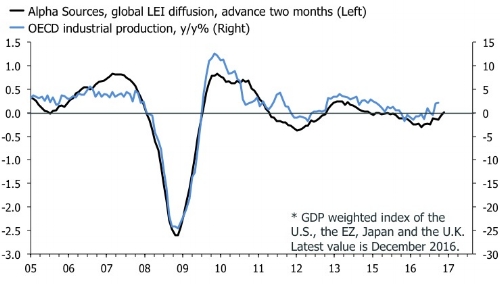
In any case, the message we're currently getting from the surveys is that global economic hard data will be strong in Q1. But what about other leading indicators? In my last post I said that momentum of headline leading indices—which comprise both hard and soft data—was picking up. I was surprised, however, to see that my index is currently not pointing to upside risk for OECD industrial production growth. On the contrary, it suggests that output, which rose 2.2% y/y in December, is slightly ahead of the leading index. I suspect the leading index will catch up with production once we have more data from Q1, but it is an interesting message in contrast to the OECD IP chart above from Nordea.
Sometimes we just have to wait and see what the actual data delivers. Remember also that even if the hard data, in the first release, disappoints revisions often will show that the survey data were right all along. That is why we call these things leading indicators. Anyway, I have moved around in circles enough here. I am not sure that I have provided more answers than questions. One thing is for certain. Hard data in Q1 will be the most interesting set of numbers since, well, Q4.


